
After a few years, we are pleased to introduce the new updated DJ Marcx logo, isotype and brand position.
The new logo of DJ Marcx reflects his transition into adulthood, marking a departure from the youthful and informal image conveyed by the previous logo that was associated with his early start in the DJ industry. With DJ Marcx’s maturity, the new logo exudes elegance and formality, showing his evolution and growth in both his artistic expression and his professional brand.
This design has a new minimalist, simple and elegant typography, with a deformation in the letter M for the isotype, distinguishing it from the rest of the letters, representing constant movement and providing dynamism.
This change symbolizes his artistic growth and the transformation of his brand as he continues on his musical journey.
- We attach the construction of the logo and the final logo at the bottom.
CONSTRUCTION:
LETTER M
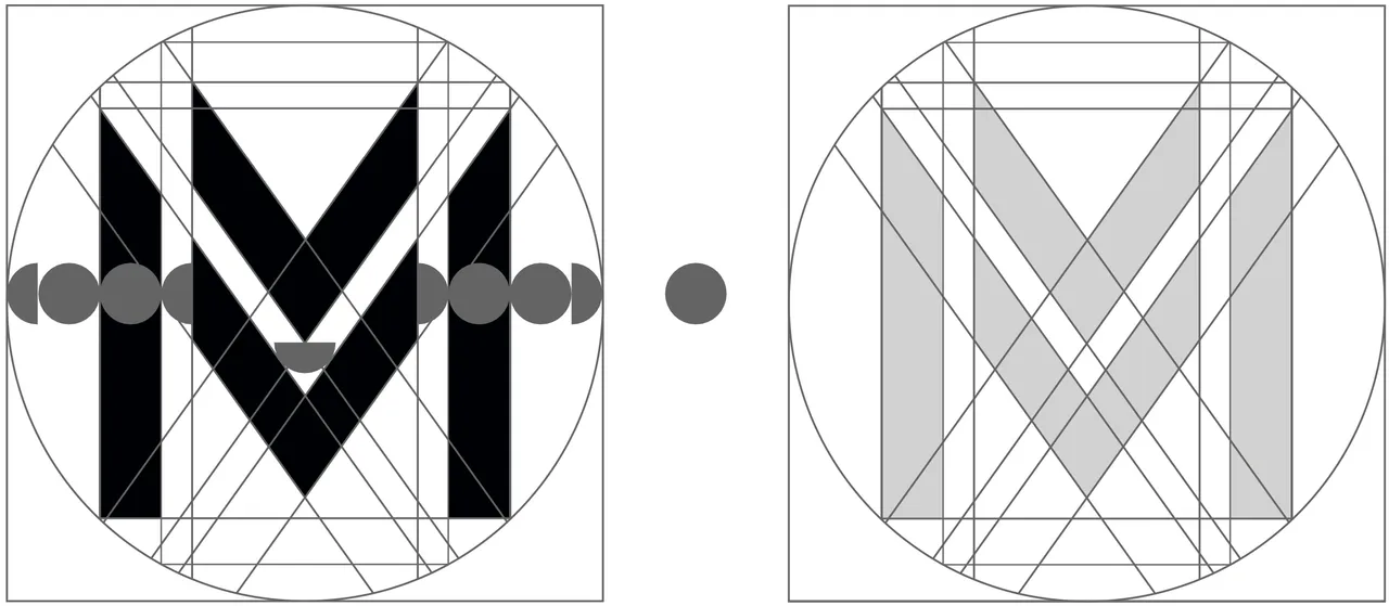
The letter M was built from this grid.
The size of the circle was taken as a reference value to give symmetry to all parts of the letter M.
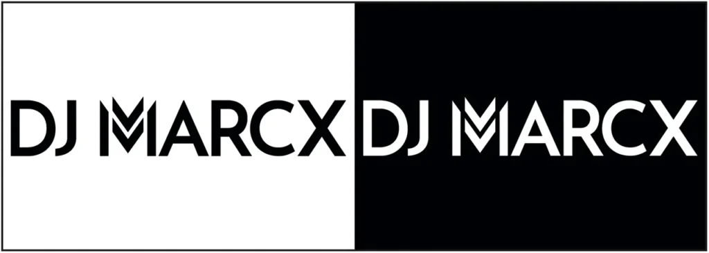
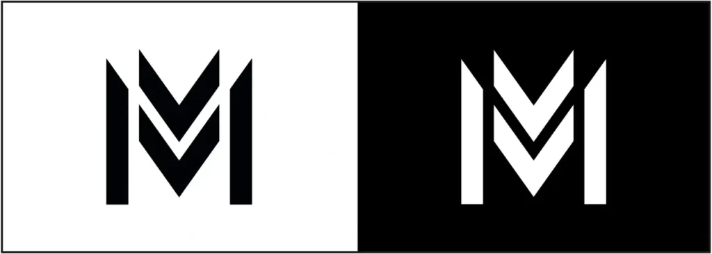
FINAL LOGO AND ISOTYPE:
BLACK AND WHITE VERSION
PREVIOUS LOGO:
This was the logo he used from the beginning as DJ Marcx in 2014 until the first rebranding in 2020.
DJ Marcx’s previous logo was born from hand-drawn strokes and then digitized.
We invite you to follow DJ Marcx on all his social networks to keep you informed of all the news.